Rainer Beihofer. A German designer from Stuttgart that used to work for Project Triangle. Carrys out a great deal of self-initiated work. Creating various publication and posters. Alot of his work has a scientific approach to it. We can see the distinct setting of rules of design. The designer balances both self initiated and client based and we can see the permutation across from self initiated through to client work.
--------
SELF INITIATED:::::
--------
SELF INITIATED:::::
--------
OBJECT TRANSFORMATIONS
"The Limited Poster Series "From Abstract to Concrete" contained seven different posters. The objects in the middle of the posters based on the three-dimensional object transformations I made in the course of Prof. Harald Stetzer during my second semester at HfG Schwäbisch Gmünd.
The transformation of the object proceeds in the background, too. Starting with the abstract in the surreal environment of outer space the posters finally leed to a concrete cube in the familiar surroundings of rural environment."
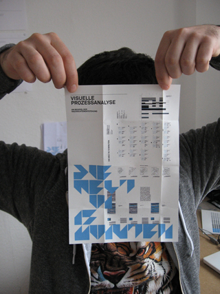
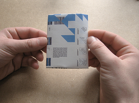
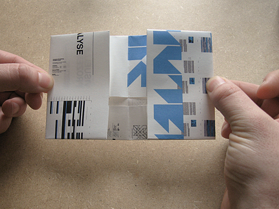
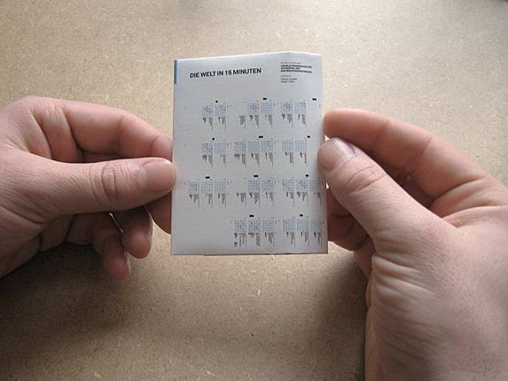
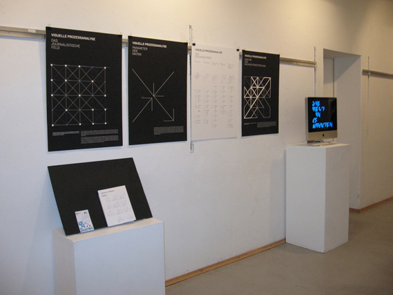
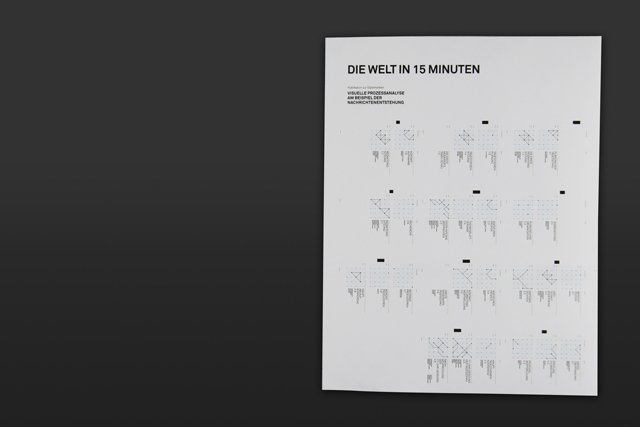
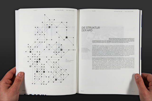
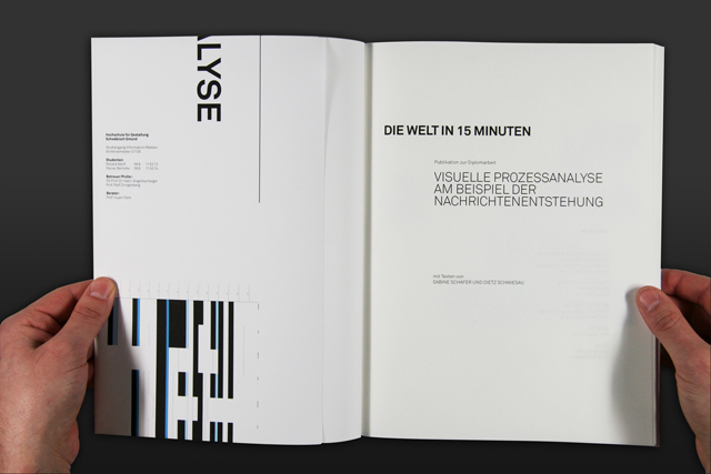
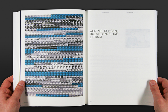
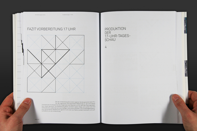
VISUALISING THE DEVELOPMENT PROCESS OF A NEWSCAST
"Ron and I developed a visual system by translating real parameters like responsibility, time, command structure, technics, etc. into graphic parameters. Based on a newly created matrix, we generated a huge amount of abstract graphics which are easy to analyse and miscellaneous to use.
We applied this process analysis tool within our thesis to create and illustrate a book about the development of the Tagesschau, germany's most important newscast. Beside these graphics of the workflow the book contains all the necessary information about the relationships of the editorial staff and the influence each one has on creating the news of our daily dispatch."
--------
Posters::::::
--------
 ---------
---------Publication::::
 ---------
Client work
---------
---------
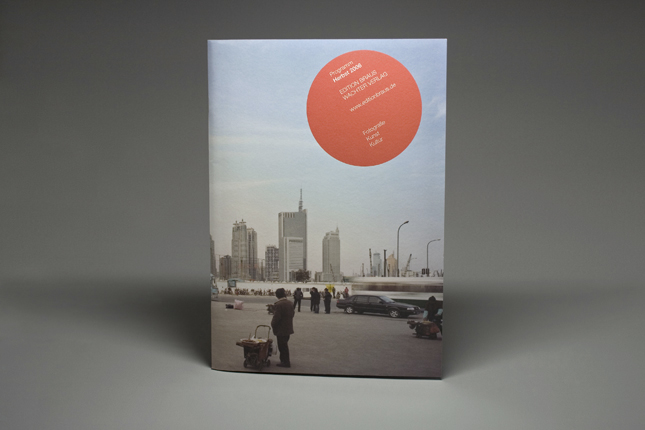
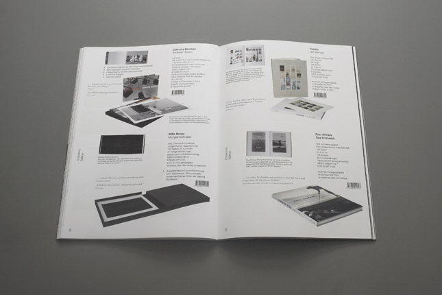
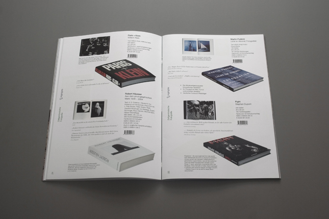
EDITION BRAUS CATALOGUE
Another project from my internship with design studio Projekttriangle was the publishing house catalogue of new publications for the German publisher Edition Braus. The specific challenge was that we were pressed for time thus I had to design and produce the catalogue simultaneously.
The biannual released catalogue contains different kind of book presentations sorted by e.g. topics, categories or date of publication as well as special overview pages for booksellers.
 -----------
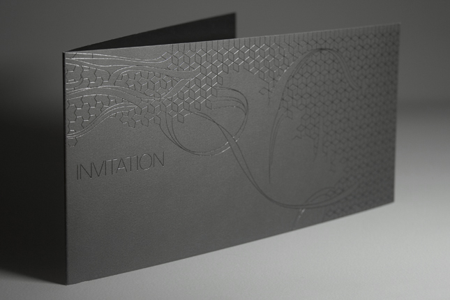
HUGO BOSS CARDS
When the international fashion group Hugo Boss AG asked Projekttriangle to design all the mailings for the company Hugo Boss and its labels Hugo Boss, Boss Black, Boss Selection, Boss Orange and Hugo, PT hired me as a freelancer to realise their already existing concept.
The whole sets contained different birthday, thank you and presale cards, premium and standard invitations. I made some layouts as well as the entire artwork, searched and chose the different materials. Besides various special papers we used foil, textile, even wood, different print and surface finishings.
 ----------
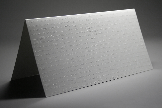
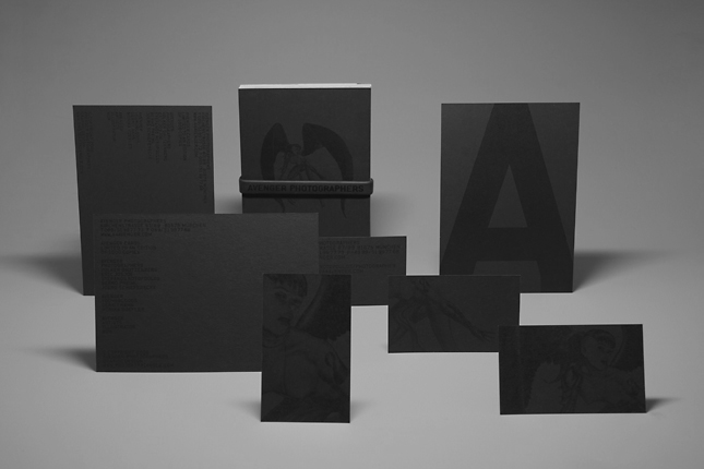
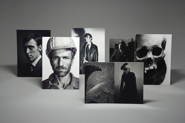
AVENGER PHOTOGRAPHERS CARDS
After redesigning the stationery, Avenger asked Projekttriangle for designing a give-away, they needed for a big event. The give-away should show selected works of the photographers but its single parts had to work for themselves, too.
The photographers didn't have any handy portfolio, they always had to carry heavy look books. That's why we created kind of portfolio cards with the size of plain postcards, which present the selected works and could be used as business cards, too.
To accomplish almost the same luminosity as a real photo we used frequency-modulated screening and acetate lamination on C-1-S paper. A silk-screen printed awareness bracelet kept the set together.
---------
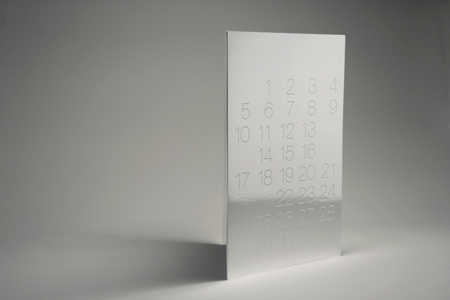
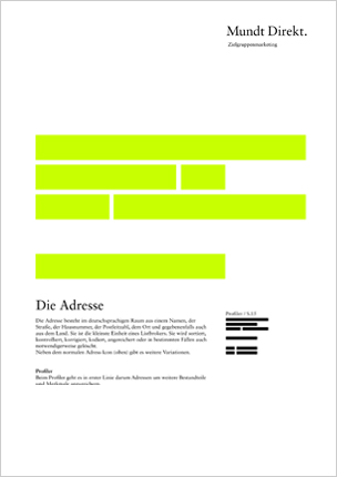
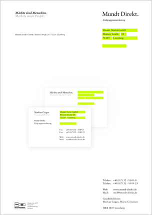
MUNDT DIREKT
At the end of my internship with Projekttriangle I created a new corporate design for the German list broker Mundt Direkt. I developed a sign system that contains a special icon for every application and every service or product Mundt Direkt offers.
The icons are based on an abstraction of an address (as the smalest unit for a list broker). Every other icon contains at least parts of that address icon and was built within the same grid. The logo is very simple so that it can't be extended and realised in many ways (printed, embossed, punched, foil stamped, etc.).
The pictures to the right show some possible applications I designed for the final presentation. Unfortunately the project was not realised.
No comments:
Post a Comment